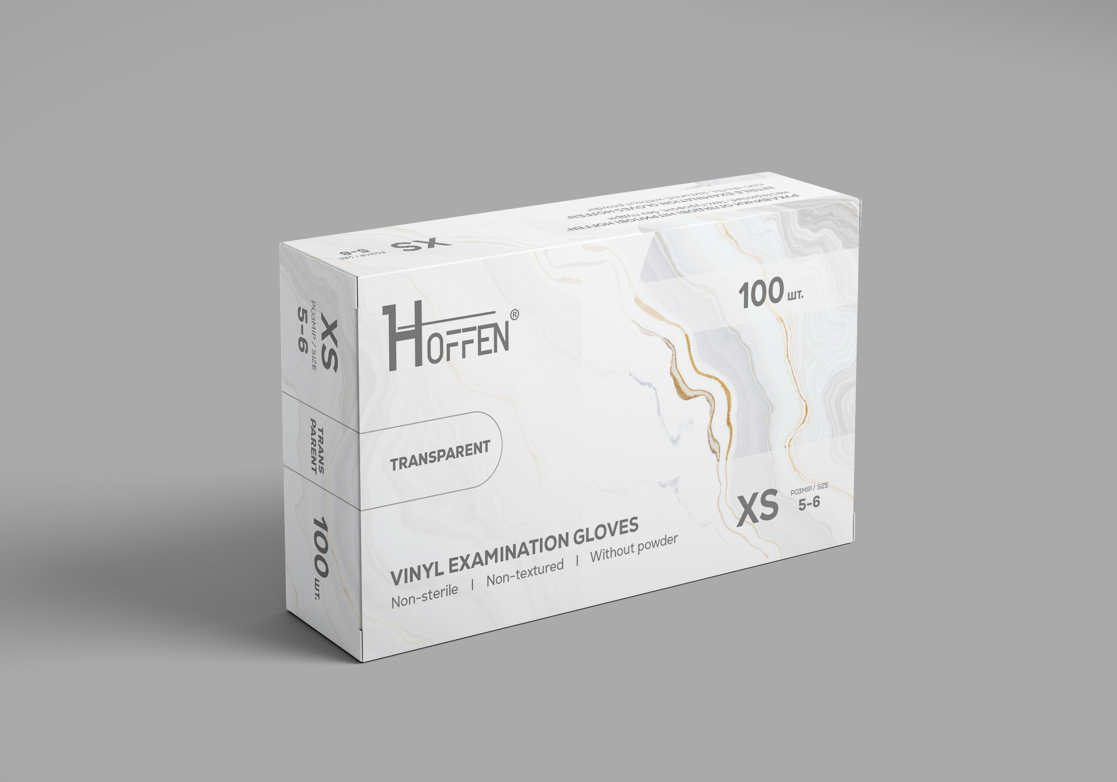
We developed packaging design for the HOFFEN disposable examination glove series. The task was to create a recognizable visual system for different product types and colors while clearly communicating their key characteristics. The design combines a restrained professional aesthetic, expressive typography, and decorative textures that help differentiate individual products within the series.
For the HOFFEN brand, we developed packaging design for a series of disposable examination gloves. The task was to create not just an individual product box, but a cohesive visual system that could be scaled across different product types, colors, and specifications. As a result, the packaging gained a distinctive character, while individual products in the series remain easy to differentiate.
The concept is based on a combination of restrained professional presentation and expressive decorative graphics. The product belongs to a category where packaging needs to communicate important information quickly: glove type, color, size, quantity, and key properties. Therefore, we built the composition in a way that keeps technical specifications clearly visible even within a relatively rich visual design.
The series includes different glove options, including nitrile and vinyl models. Instead of creating a separate design for each product, we developed a universal compositional system. It allows the packaging to maintain a consistent character while using different color solutions, textures, and markings.
Each model was given its own visual code. The purple packaging is used for nitrile gloves, the black version provides a more contrasting and expressive presentation, while the light version with a marble texture is used for vinyl gloves. As a result, the products look like part of a single product line while remaining visually distinct from one another.
Textures play an important role in the concept. Abstract marble and geometric patterns add character to the packaging and allow us to move away from the sterile and overly utilitarian appearance typical of medical products. At the same time, the decorative elements do not obscure the main information, but instead work as a background and an additional differentiation tool.
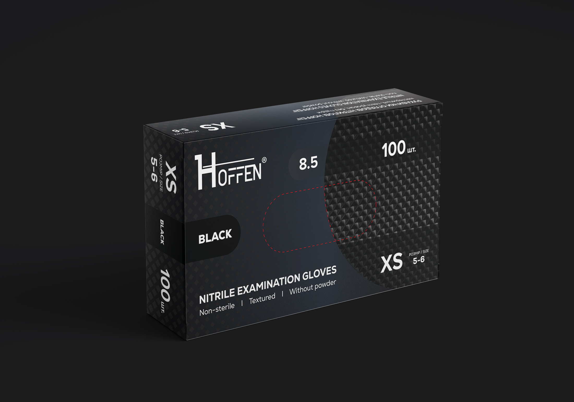
Particular attention was paid to the placement of textual information. The HOFFEN name became one of the main elements on the front side, creating a clear brand zone. The key product characteristics are placed alongside it: glove type, color, size, quantity, and other specifications.
The information is divided according to levels of importance, allowing the packaging to be quickly read in a retail environment. The most important parameters receive greater visual emphasis, while technical specifications remain compact and do not overload the composition.
For individual models, contrasting color blocks with color names are used. They function both as decorative elements and as practical navigation markers. This is especially important for a series where the same packaging structure is used for products with different types and colors.
During the development process, we considered not only how the packaging would look on screen, but also how the design would work on the actual box. The composition was adapted to the packaging dieline, while graphic elements transition between the different surfaces and create a cohesive visual appearance from different angles.
This approach allows the developed system to be used for further product range expansion. By changing individual parameters, color solutions, and information blocks, new SKUs can be created without completely redesigning the packaging. At the same time, the entire product line maintains a consistent visual style and recognizability.
As a result, we created packaging design that combines the functionality of medical products with a more distinctive and contemporary visual presentation. The HOFFEN series received a cohesive design system in which typography, color, textures, and information blocks work as a unified structure. This allows the brand to maintain recognition, provide clear navigation between products, and create a distinctive appearance for the packaging on the shelf.